Here are some quick tutorials to help you get started with the Table Builder feature for AmaLinks Pro®.
Video: Overview Demo
AmaLinks Pro® – Table Builder… How it works and how to use it
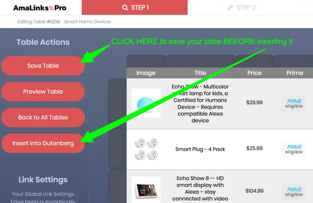
Important: Save table BEFORE inserting into Post or Page
You MUST save your table before inserting it into your WordPress Post or Page. Also – be sure to click the Save Table button any time you make any changes or edits.

Video: Responsiveness and Other Settings
AmaLinks Pro® – Table Builder… How to setup responsive settings and other styling settings
Note: Responsiveness for tables is NOT 100% automatic – YOU must set preferences
Making a truly responsive product comparison table builder, like we’ve done here with AmaLinks Pro®, was not a small undertaking. It was a true challenge to create a table builder that works seamlessly on any screen size while keeping all users happy at the same time.
It is VERY important that you understand that the comparison tables are not (and cannot be) automatically responsive. Since so many different users have so many different types of site setups and preferences – the only way to make a truly responsive and fully customizable table builder was to force users to set the responsive settings themselves when they create their comparison tables.
We make this extremely easy. Here’s how it works… Basically, certain screen sizes (or content areas) are only able to display a certain number of columns. You can choose to show as many columns as you want – but you MUST hide certain columns on some of the screen sizes. If you choose a whole bunch of columns – you may even choose to ‘hide’ some of your columns on larger screen sizes as well.
Hidden columns don’t just disappear – they actually appear inline below your unhidden columns. You can set preferences for how you want your hidden columns displayed in Settings under your WP Menu > AmaLinks Pro® > Tables and then click on the Global Table Settings tab and scroll down to Table Custom Responsive Settings.
Getting your responsive setting preferences set just right may take some trial & error. It all depends on your container width settings and your screen sizes and other settings. Here are some general tips & suggestions…
- Leave only 2 columns unhidden on mobile (image & price or image & CTA)
- hide the rest of the columns and they will display inline (underneath) depending on your settings
- Leave only 4 or 5 columns unhidden on the desktop view – depending on your content width area
- Edit Titles so they aren’t as long – Amazon sellers tend to overuse the Title and stuff it with SEO nonsense
- Hide Titles – even on desktop – maybe display the Brand name instead
Again – these are just tips and suggestions. Please use trial and error and use whatever works best for you. Once you get it down with one table – it will be extremely easy for you to replicate those table settings for the rest of the tables you create on that same site.
Update: Editable CTA Buttons and ‘Top’ Product Row
The early versions of the Table Builder Add-on did not allow you to change or edit the CTA button text. Now – you can change the default text in settings AND you can change the CTA button text on each button right within the table editor!
We also added functionality to include a ‘Top’ product banner for one selected row per table with other subtle differences in that row to make it stand out from the other rows.